Increased LTV by 37% with a new pricing model
ZOE’s audience was changing from early adopters, many of whom knew the brand from the COVID Symptom Study, to a mass-market audience. Our pricing model had been built for the first group and confused the second. I led the design of a new tiered pricing architecture, from getting the team to agree its structure to designing, testing, and refining it in production.
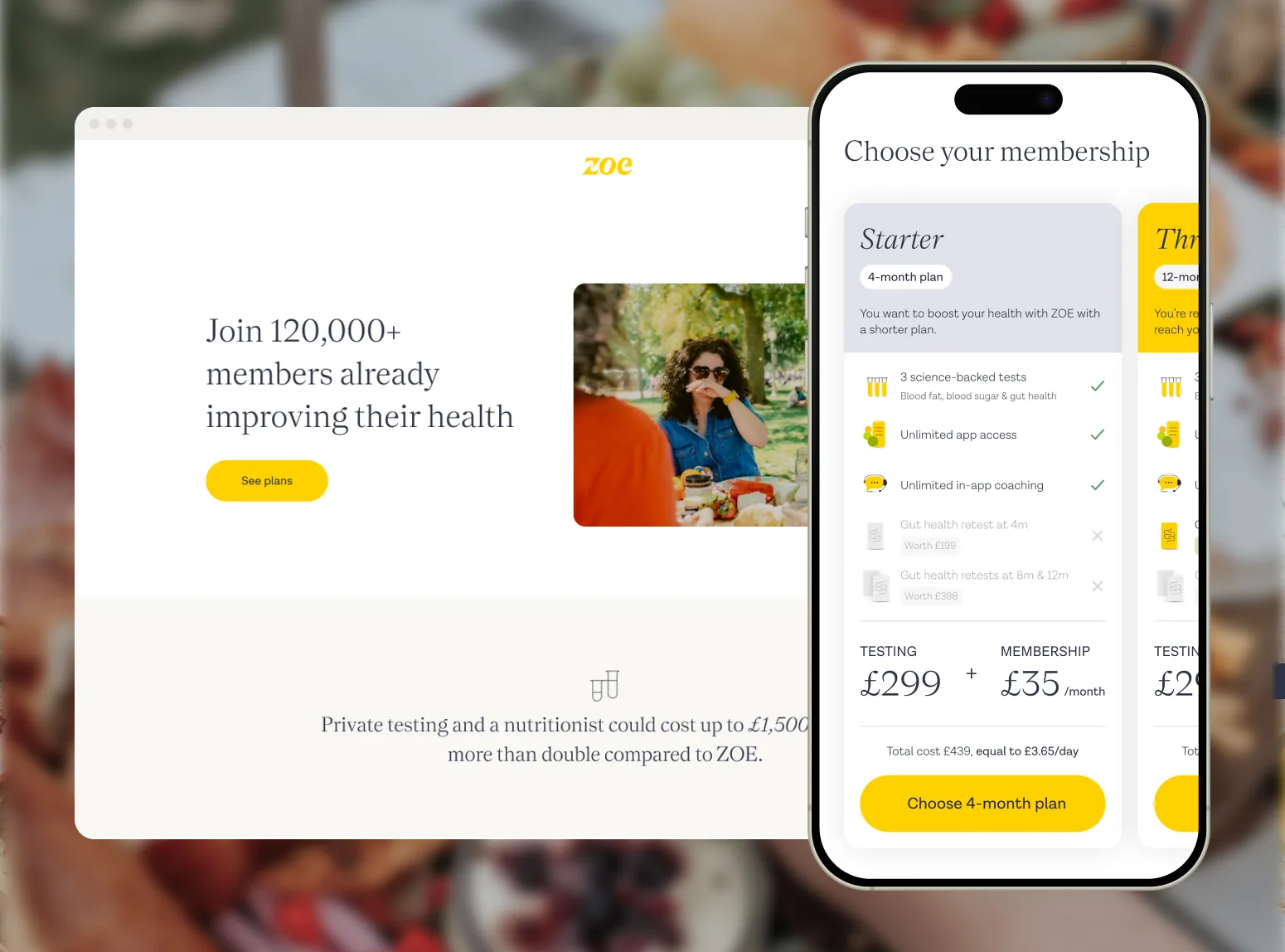
The problem
Early customers knew ZOE and were ready to buy. As we reached people who’d never heard of us, the old pricing stopped working. Customers first chose an expensive membership plan, and only after deciding to pay for it did they find out, on the next page, that they’d also need to pay a large, up-front fee for the testing kit. It was hard to understand and hard to choose from: some customers felt duped, and some left negative reviews as a result.
We had two goals: convert more cold leads, and make pricing clear enough that people knew what they were paying for.
Early stages
I studied how pricing is usually structured for hundreds of companies to understand the principles behind it, how they price anchor, and how they explain what’s included. I turned this research into rough wireframes of several possible models for us and brought them to the team. When we said “tiers” or “anchoring”, each of us pictured something different. Putting visual artefacts in front of the team brought everyone around the table and made sure we were talking about the same concepts.
This raised loads more questions, which highlighted the complexity of a new pricing architecture and showed how much we still hadn’t agreed on. I ran a set of workshops with the team to align between ourselves and with the leadership team. After some back and forth, we had settled many of the unknowns and had more confidence about the chosen direction.
Design
With the direction set, I explored the design both wide and deep, across hundreds of variants, some of which are shown below. They ranged from layout, content and colour to even different ways of choosing a plan, such as a static page of tiers vs. a build-your-own-plan experience.
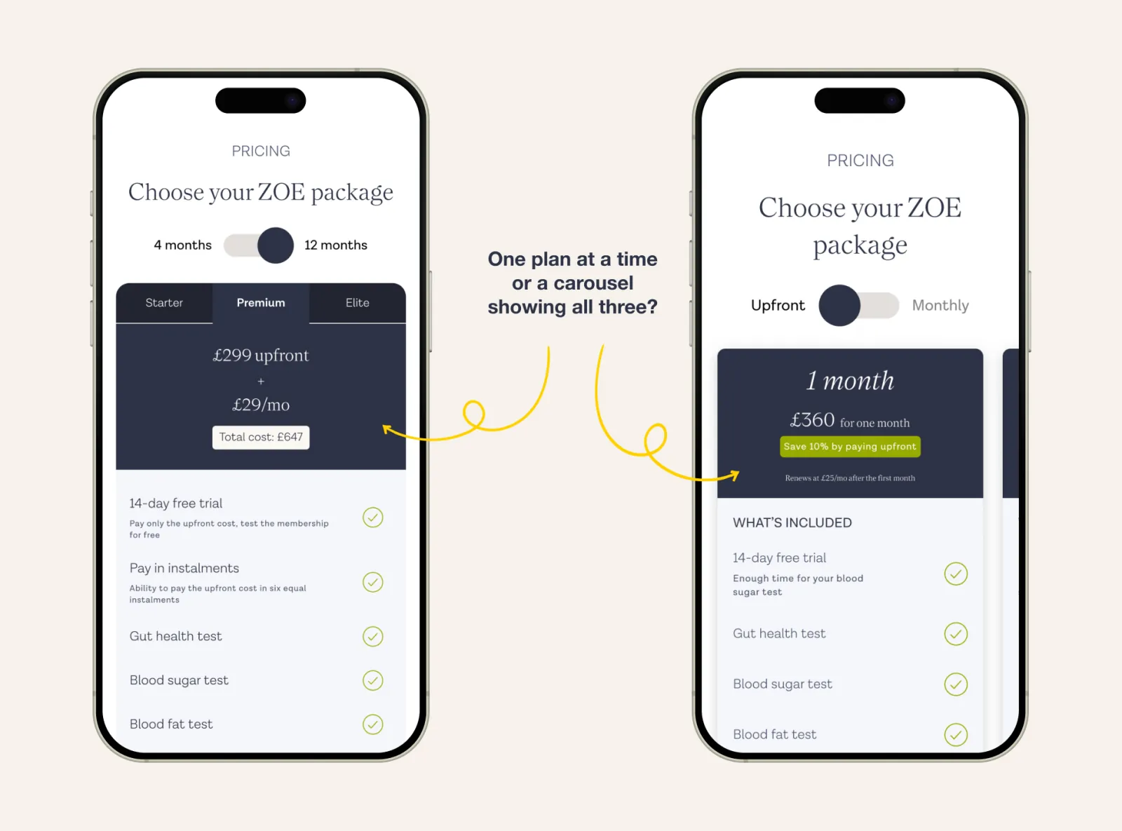
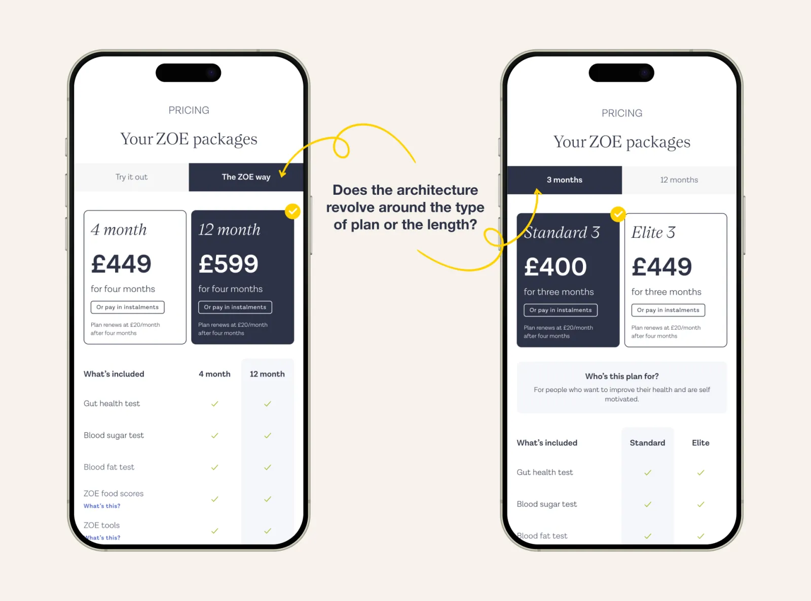
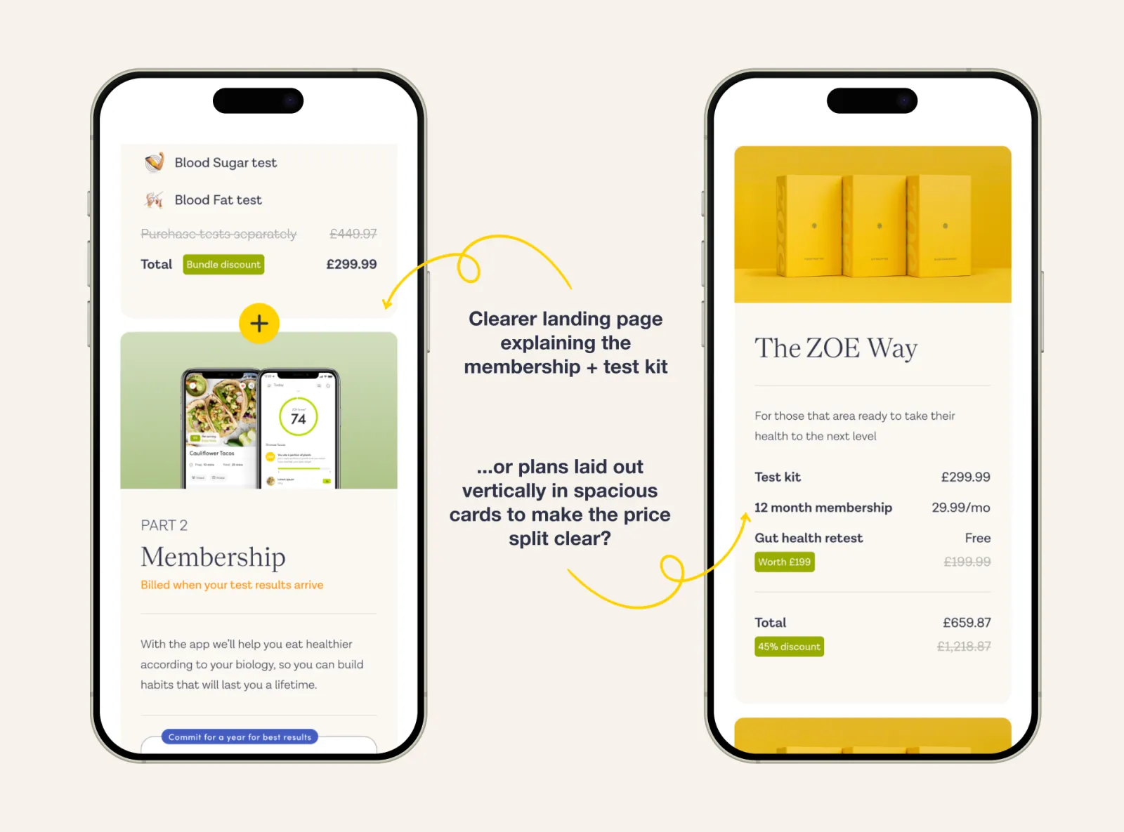
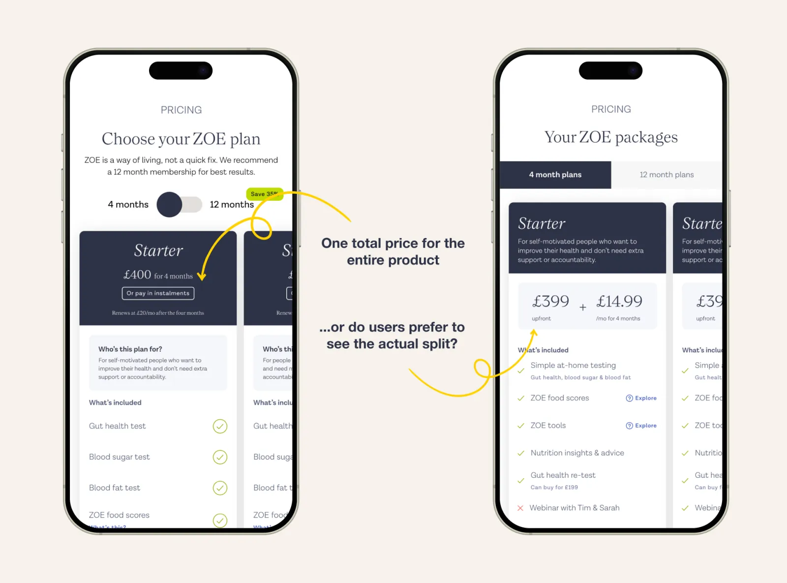
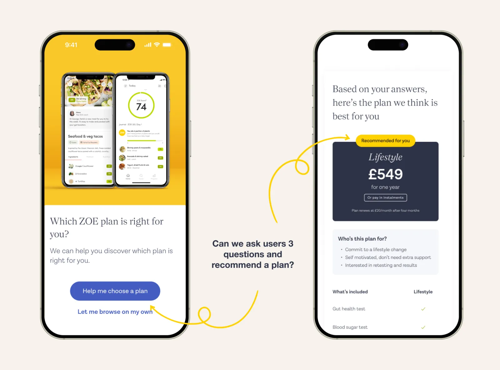
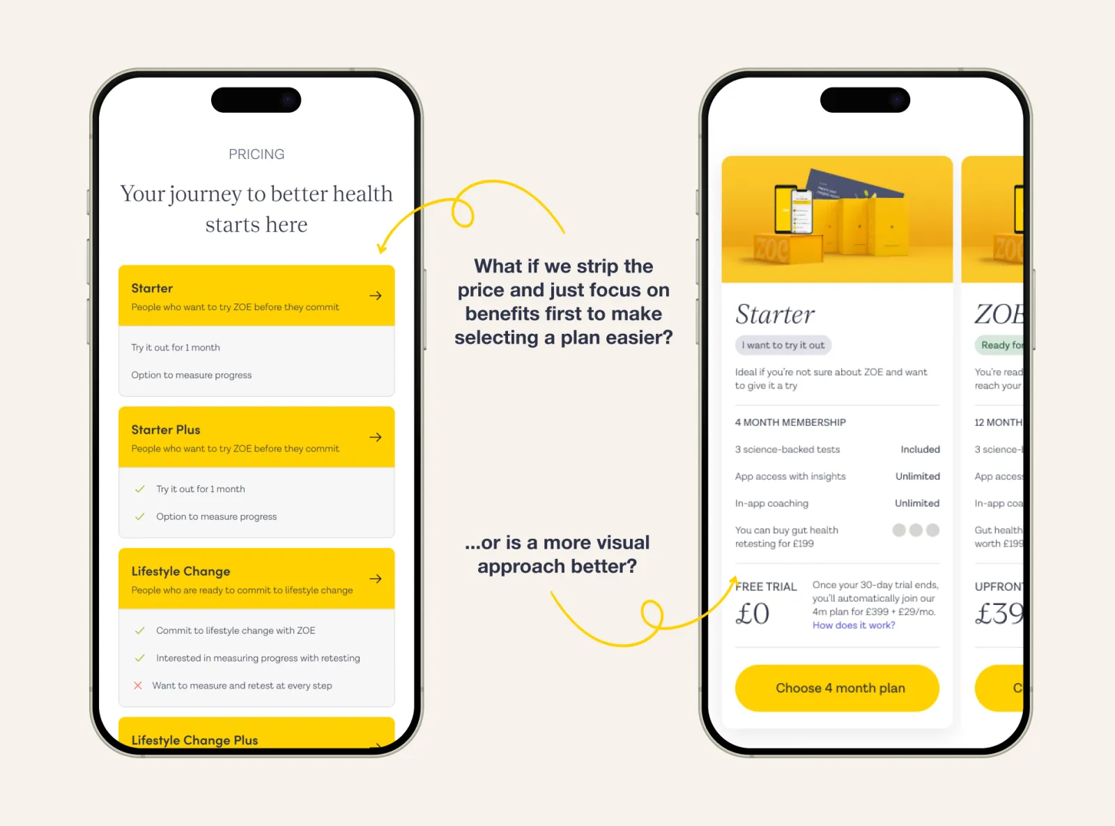
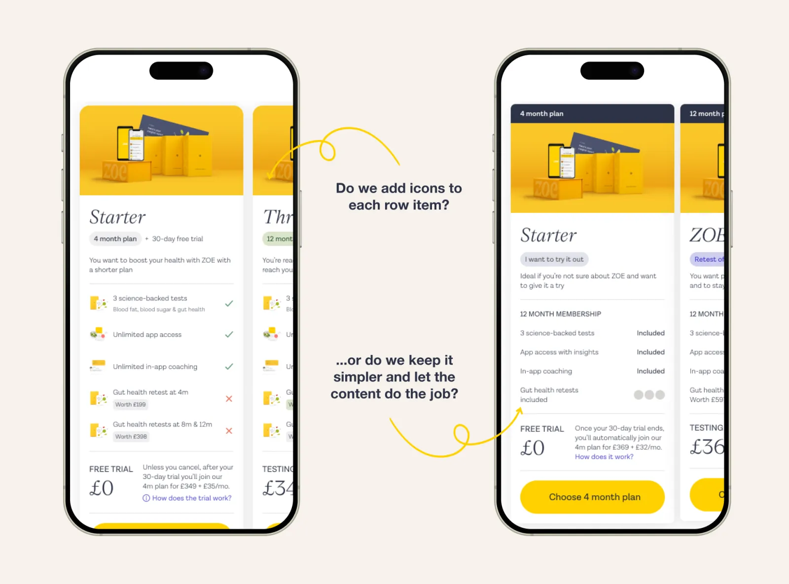
Some of the design explorations and questions we had to answer.
Testing
There was a huge amount of variation, and the team was often split on how to answer the questions it raised. Whenever that happened, we built prototypes of the competing options and took them into testing. To keep results consistent from one test to the next, I set three principles to test against:
Clarity
Do participants understand what they’ve bought?
Transparency
Do participants remember how much they’ve paid?
Simplicity
Can participants recall what’s different between the tiers?
We ran nine rounds of testing. Some compared overall design directions, others compared minute details. These sessions answered many of our questions and helped narrow down what the first version should look like.
Results
We started out aiming to increase conversion, but during the project we realised that conversion is easy to manipulate with tactics that don’t leave the business better off. So we moved to lifetime value (LTV), which better reflected how many people we keep, not just how many we convert.
In the first A/B we ran, the new pricing model doubled conversion, but the free trial we offered cut into margins. Over the next 2 months, we tested four variations of the same model, removing the trial and fixing problems that only appeared once real customers used it.
The final version delivered:
+37%
Lifetime value vs. the old pricing
4.2 → 4.6
Trustpilot score
↓ Complaints
Received by Customer Support about pricing
This is a short version. Full case study available on request.