Our customers were frustrated with Help & Support, so they overloaded our call centre. We redesigned the experience to allow them to self-serve first and only then contact us. In doing so, we removed customer frustration and decreased call centre costs, and also improved our NPS score in the process.
Team
This was a team effort! My product team consisted of engineers, QA testers, product owners, a business analyst, a CMS manager, a scrum master, and a separate analytics team.
Would rather watch a video instead?
Instead of reading through this whole case study by yourself, let me narrate the project for you, so I can also give you extra context.
Goals
British Gas was in the middle of a digital transformation, trying to reduce operational costs, improve certain KPIs, and give customers a better experience at the same time. This project was a matter of balancing the needs of everyone, and I knew that in a 105-year-old organisation the best way to make progress is to be smart about the use of product analytics and to manage up.
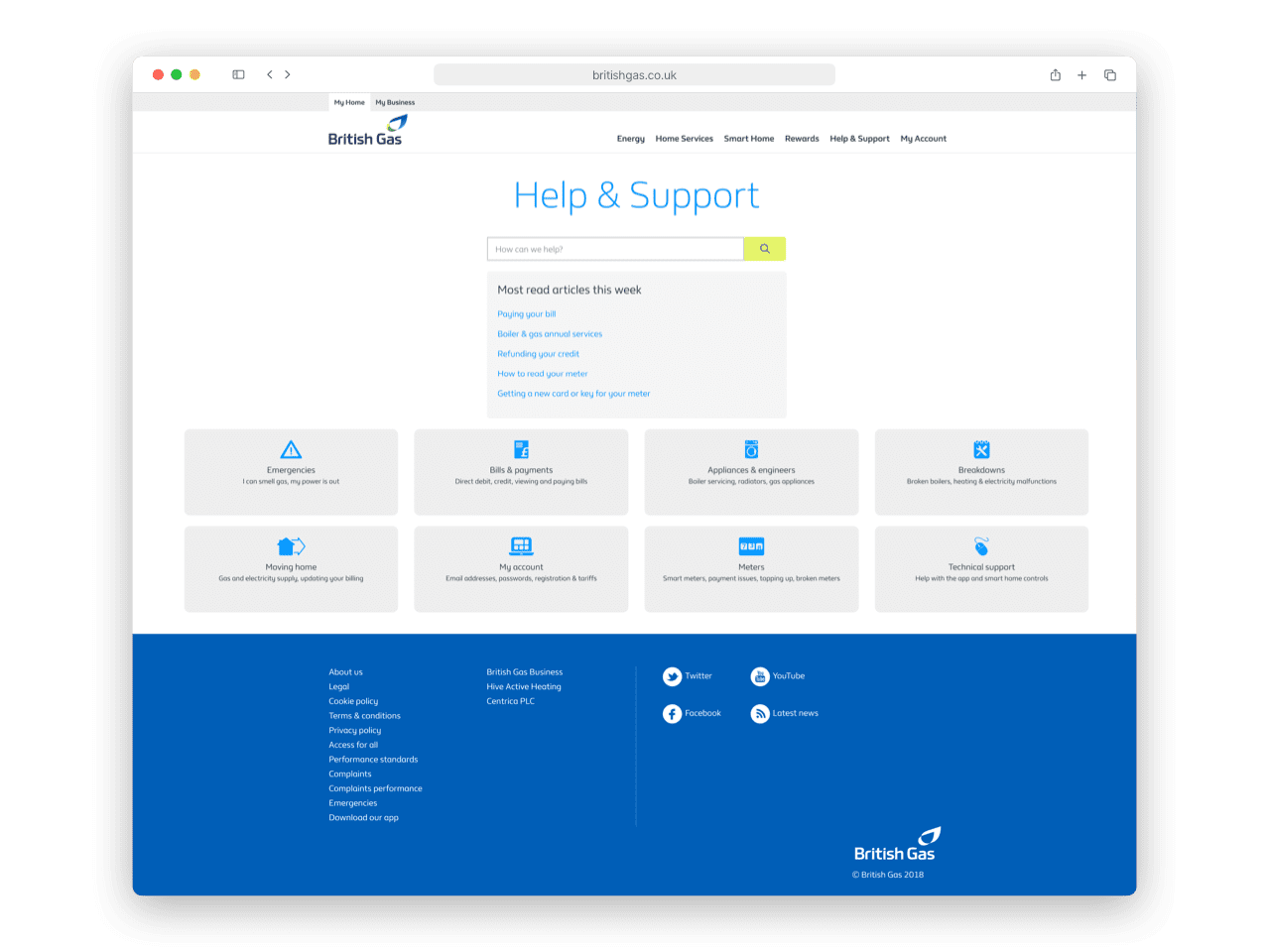
The legacy design featured a search bar, but it was not performing well
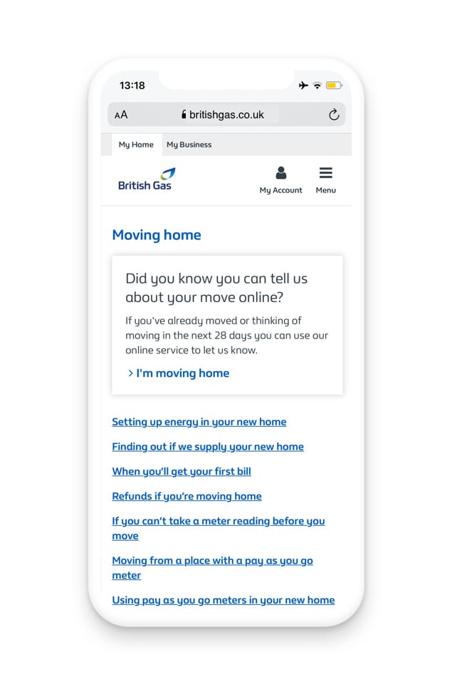
Most people were browsing our content through these eight categories, but this was not straightforward for them
The British Gas legacy design my team inherited
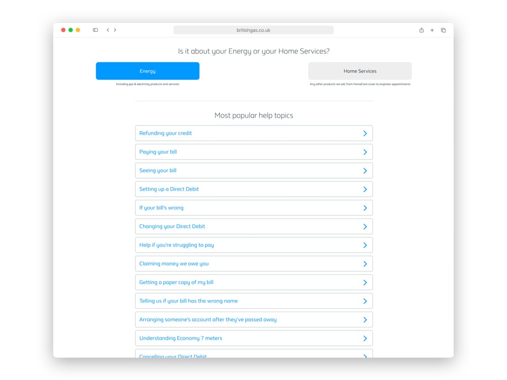
Energy and Home Services, our two content tiers, were exposing our business structure and confused our customers.
The two content tiers that proved to be problematic later on
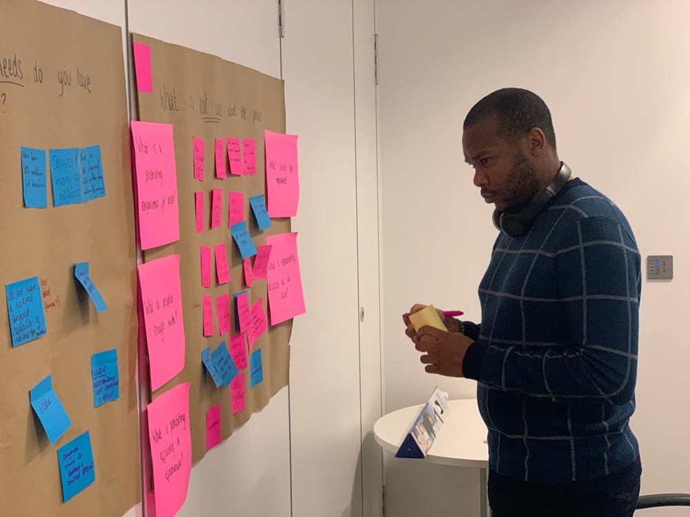
Discovery
To get familiar with the product I went on a Discovery journey and listening tour. These were some of the activities performed:
Digging through old reports
Previous teams also had to deal with these issues, and everyone found four areas of improvement: content, searchability, usability, and processes.
Running intercept surveys
We ran intercept studies to understand what customers were trying to achieve on Help & Support and mapped that out against our current capabilities and content.
“I don't understand why it takes me so long to find a way to contact you. I'm paying through the nose to be your customer, and I need to get in touch with someone.”
Anonymous customerIntercept study answer
Analysing raw NPS data
While the NPS score is not necessarily the most reliable metric, the raw data we extracted gave us access to large amounts of written feedback from our customers.
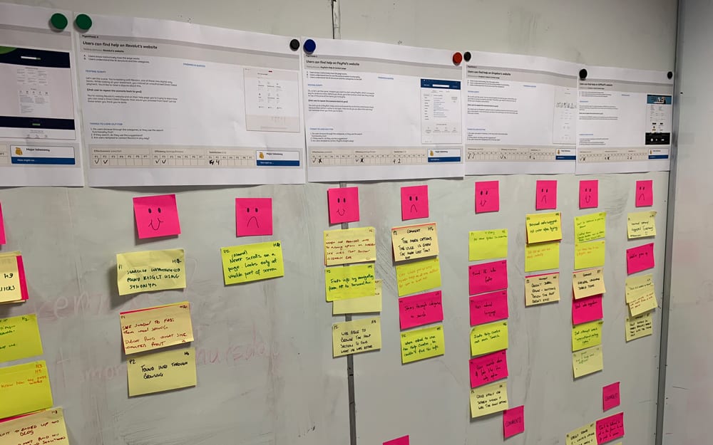
Usability testing
We ran usability testing sessions and invited senior stakeholders in the room to make our process transparent and to get executive buy-in for the project.
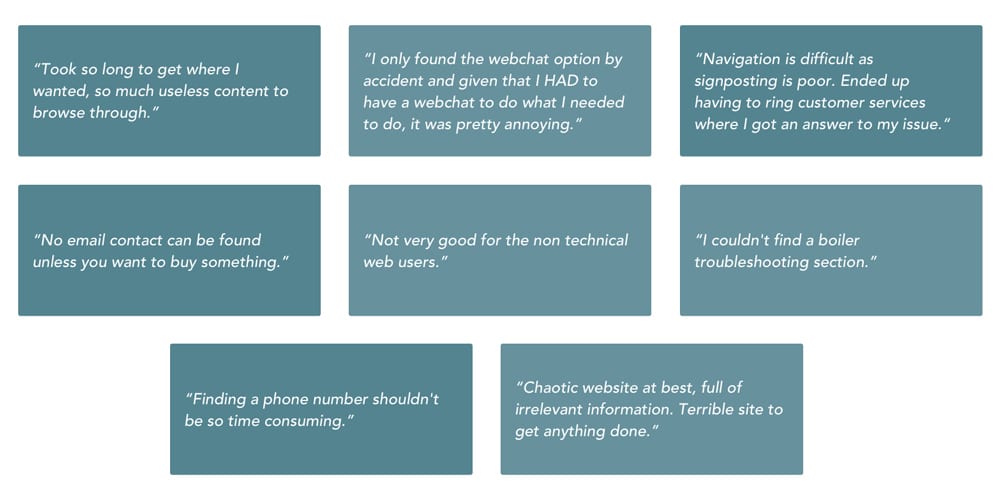
Comments straight from the NPS survey
Main focus areas
After clustering all our research insights, we discovered these five major issues:
Customers couldn’t easily find a way to contact us
We exposed our business structure to visitors through our content
Navigating through our FAQs was confusing
We had a technically inadequate search engine
Our single-page approach damaged the efforts of our SEO team
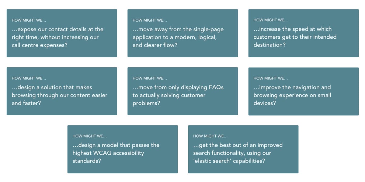
Ideation
In preparation for an ideation workshop, we’ve sorted all our learnings into themes and created How Might We (HMW) questions. They helped us make sense of the research and kickstarted the ideation.
Workshop
I ran a brainstorming workshop with the product team to gather everyone’s input. The ideation exercises generated enough ideas for me to go do some work on my own.
Testing various support models
After watching many users struggle to browse through our FAQs, I wondered whether a search-driven model was the way to go. I shared sketches with the team, but everyone was convinced it wouldn’t work because it’s been tried before. Previous usability testing reports led me to believe the implementation was the problem, not the experience.
This stumbling block could only be removed with evidence, so I ran a session watching customers use various help models from other companies. We’ve learned that search-based support models are indeed the most effective as long as the search functionality is solid.
Testing our own prototypes
With the stumbling block removed, I created and tested high-fidelity prototypes that we kept tuning over a few weeks. Aligning with our senior stakeholders at this point was crucial — they signed off on the project, but not on our solution. Our Product Owner and myself spent countless days ironing out presentations for our senior stakeholders to get approval.
Self-serving customers
The strategy for the new Help & Support model was to let customers help themselves and, provided that fails, to contact us. Among others, we:
- moved to a search-driven design with machine learning functionality
- removed the confusing categories from the landing page
- improved our SEO to allow customers to find content faster
- placed contact options strategically so that customers could find them after self-serving
- created a process for better managing the content library.
Design
British Gas uses a design system, so there was not a lot of wiggle room to be creative. However, the redesign required us to create a few new elements. Once tested, we were able to add them to the design system, to be used by the wider design team.
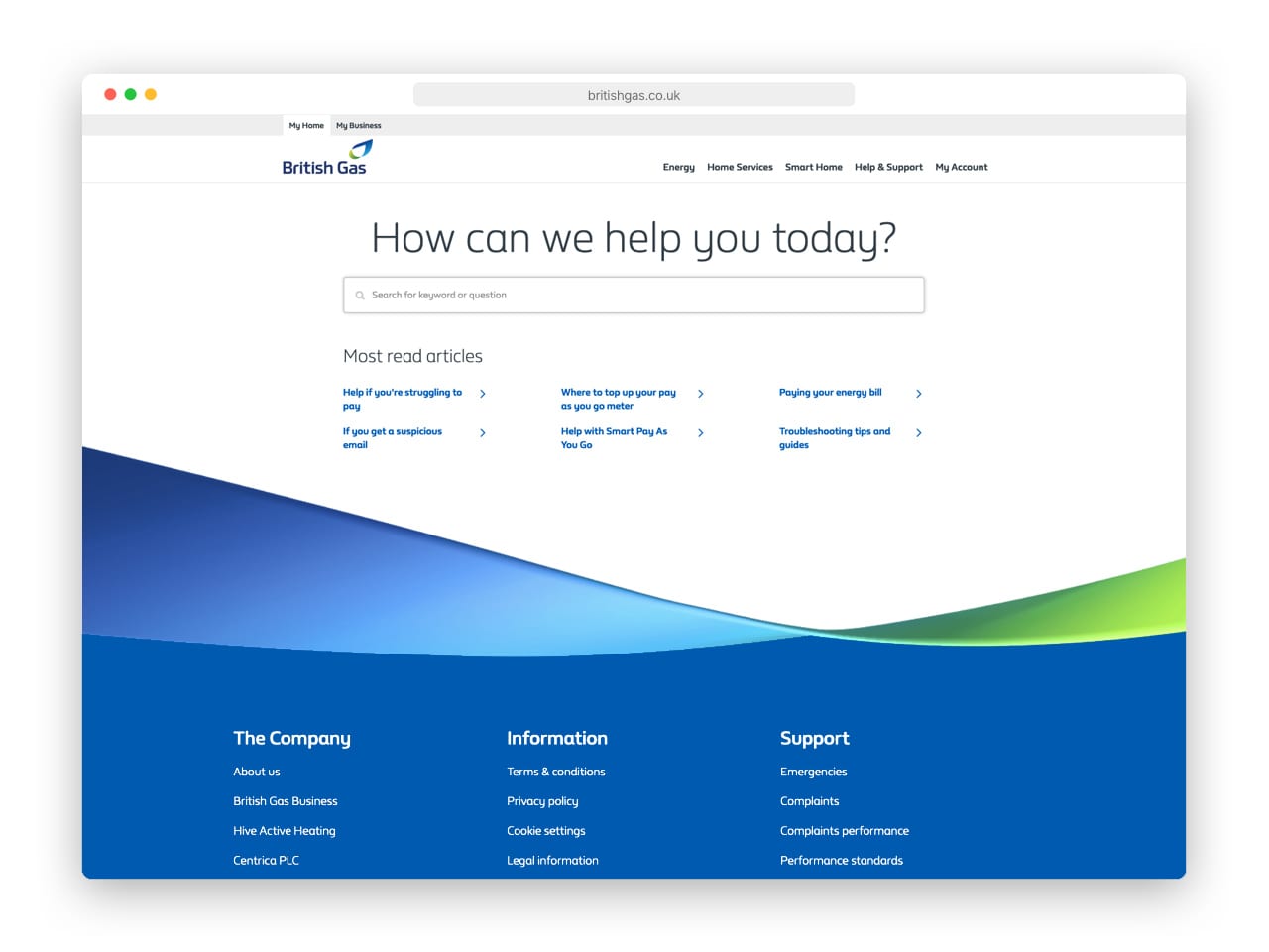
The improved search functionality not only understood what customers said, but also what they meant.
The most read articles were kept as well, since our analytics showed they were being very useful.
The new British Gas Help & Support landing page design
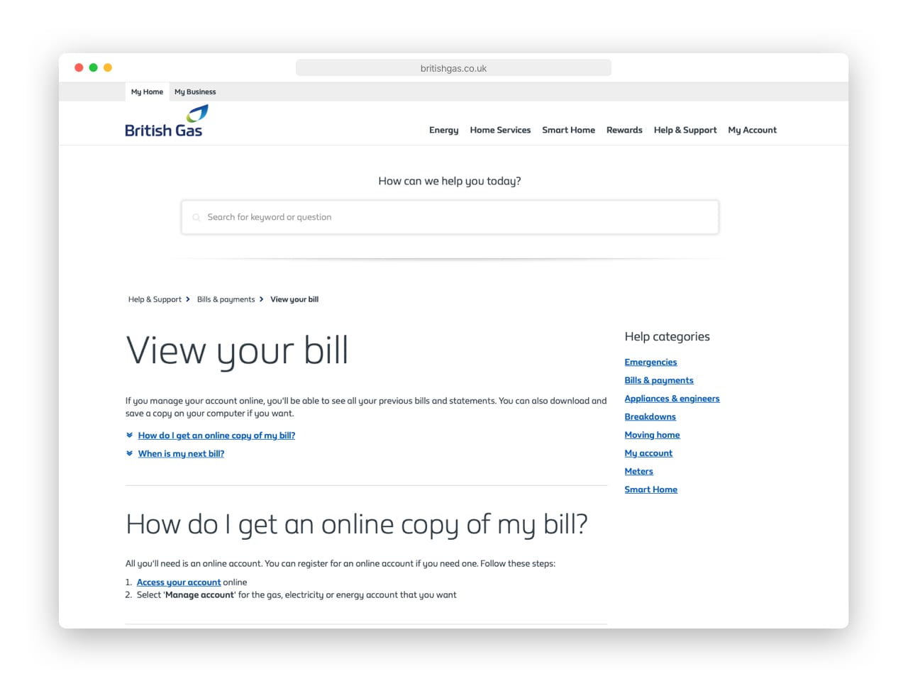
The search bar appears at the top of each article, for easy navigation between FAQs.
The help categories have been moved to the sidebar, taking a much less prominent place than before.
The new article view
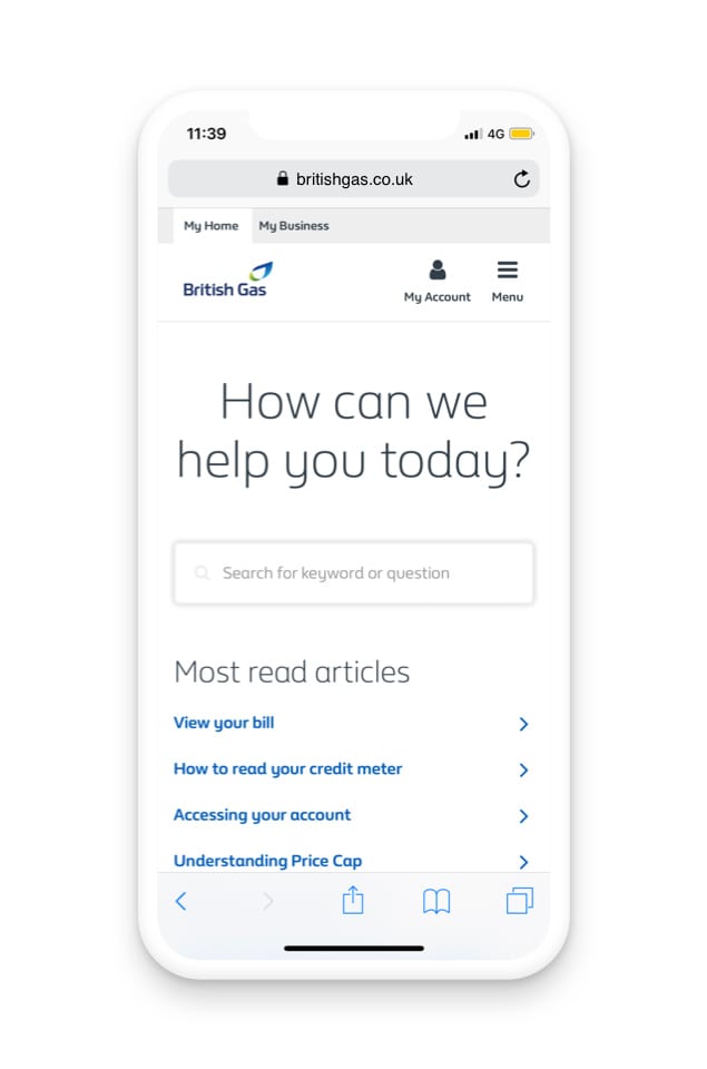
Most of the content on the landing page sits above the fold on mobile platforms
The Help & Support landing page on mobile
The search bar above the FAQs is not visible at first, to keep the focus on the content. It becomes visible when the user scrolls back up, as that’s when they’re more likely to need it.
The article viewer built on solid principles of typography and legibility
The Search CTAs were just one of our successful experiments. Another one was adding CTAs on the categories page.
The categories page has been turned into a secondary way of navigating
Post-launch optimisation
Soon after launch we noticed customers would navigate to an FAQ only to find a button to a functionality (say ‘Pay my bill’ or ‘Set up a Direct Debit’). To reduce friction we added a feature allowing customers to go directly to a functionality from search. In testing we’ve learned that because customers thought the CTAs looked like Headings, they weren’t clicking on them, so we fixed that. This is just one example of a change we made to our initial design.
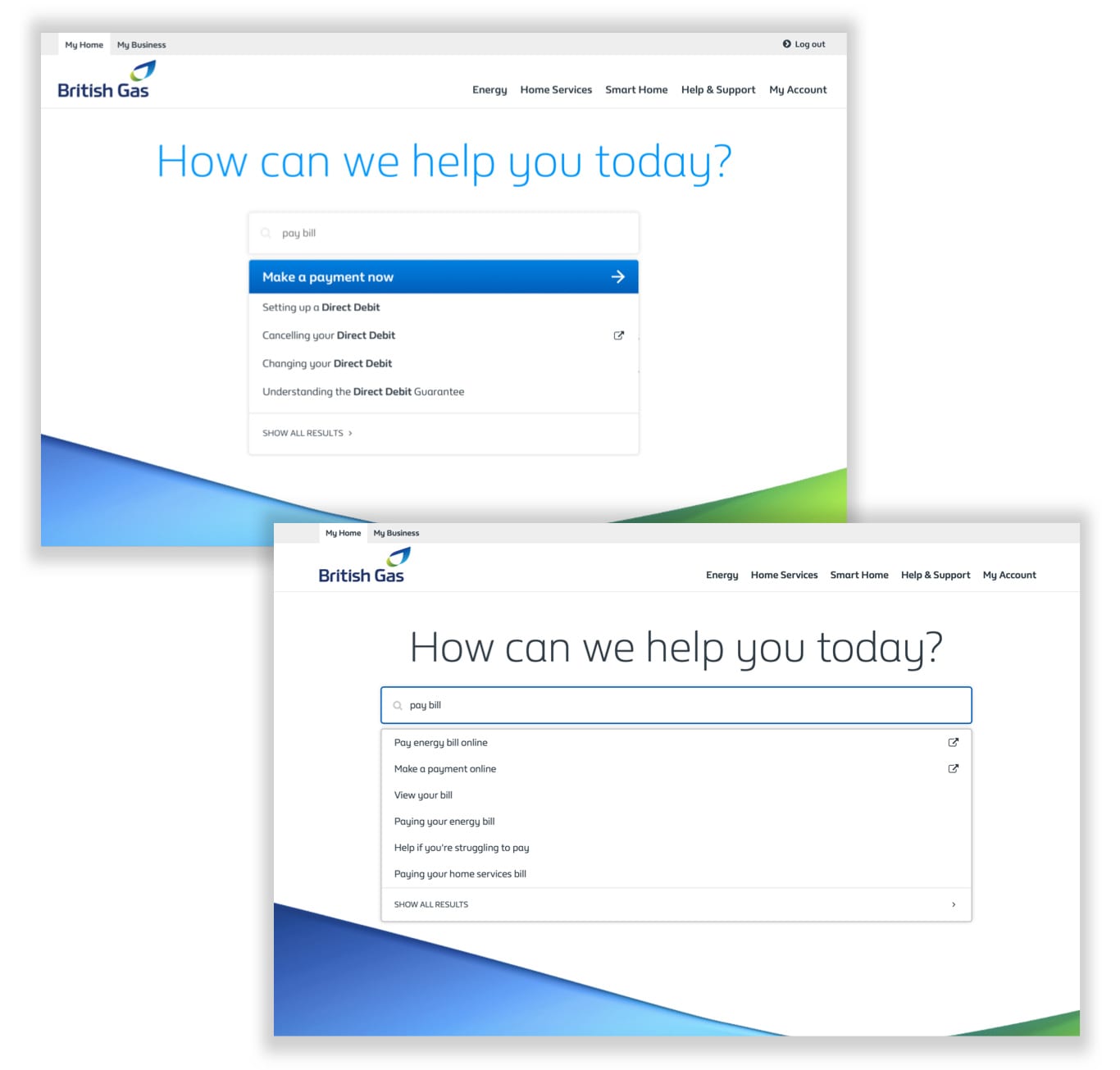
In the initial design, customers thought the Search CTA was a title, so they never clicked on it.
In the second iteration we changed the design and made the Search CTA look like any other search result.
Outcomes
The NPS score has increased by ≈25% since we shipped, and most problems highlighted in Discovery have vanished. The redesign made a big splash because it helped cut a considerable amount of calls from the call centre – we managed to deliver a decrease in costs of £700k per year.
700
Saved per year
25
NPS increase
Final words
At British Gas I got to work with a brilliant team, mentored younger designers, and learned the practicalities of scaling Design in an organisation that inherently has other priorities. I’ve also learned how engineers can sometimes out-design a designer, how being told ‘no’ many times doesn’t mean it’s the end of the road, and how bringing the entire team for testing changes their perspective towards the importance of our work.