After years of working with short-term contractors, junior designers with minimal experience, or having no design capacity at all, Buyapowa needed someone to come on board and help them make sense of their design foundations.
Team
I was part of the product team and reported to the Product Director. I’ve also helped onboard another designer, ensuring that he takes over the Design System and continues to build on it.
This is only a brief version of the project. Reach out if you’d like to know the full story.
Goals
Buyapowa is a leading reward marketing platform allowing brands such as Vodafone, Tesco, and Vitality build and manage their referral, affiliate, and incentive marketing programs. My main task was putting together the foundations of a new, modern, all-encompassing Design System, along with redesigning a key part of their customer portal.
Discovery
The natural first step was an audit of the latest Figma file structure, components, and developer documentation. To make sense of the entire spectrum, I listed out all component instances such as buttons, input fields, and typography, and compared them to what was live in the customer portal.
Key findings
It quickly became clear that their Design System was more of a pattern library spread all throughout Figma. There was no documentation for engineers or usage guidelines. I found that their patten library suffered from fragmentation, lacked uniformity, and contained outdated elements. Consequently, the product team lacked a cohesive framework concerning design language, guidelines, and UI pattern libraries. This led to inefficiencies within the team and inconsistencies across the product.
Disjointed pattern library
Master components were located in different files, rather than in a common library. Some components were created years previously in Sketch, and were lost in the transition to Figma. It was impossible to retrieve many components, so editing them was of course no longer a possibility either.
Lack of documentation
The components were built as just that – simple components. They were not accompanied by documentation and usage guidelines for engineers. This left a lot up for interpretation, resulting in random spacing between components, multiple border radii, and inconsistent hover and negative states.
Components in need of refactoring
Since many components were built long time ago, they were not taking advantage of the latest technologies. Figma has many features bringing design and development closer – AutoLayout, variables, instances – but none of these were being used.
No WCAG compliance
While auditing the components it also became clear that they weren’t built with accessibility in mind. There were issues with legibility, colour contrast, and a lack of of consistency for core components such as main call to actions.
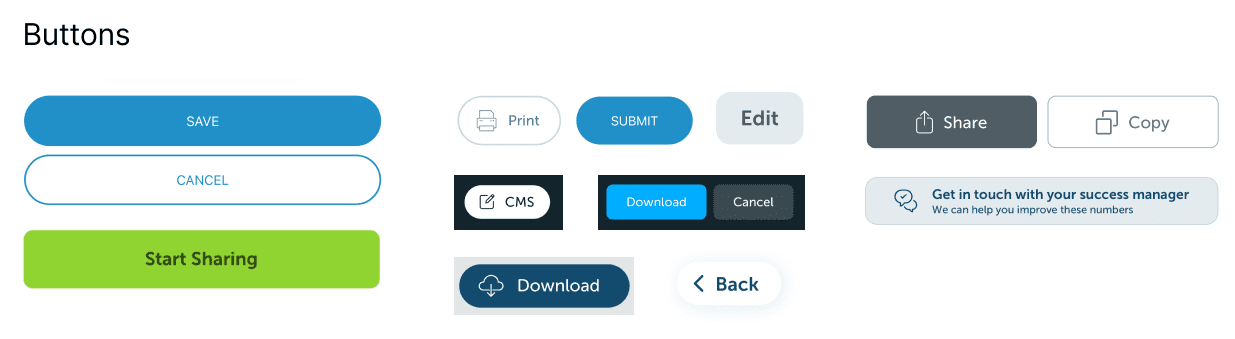
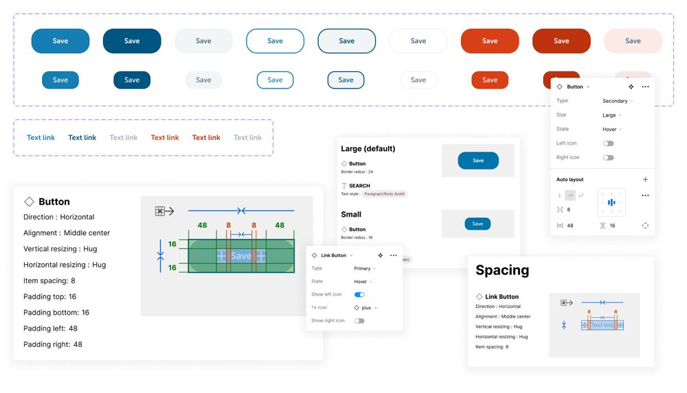
All the buttons discovered during the audit
Shaping the new system
Since there were so many inconsistencies and old components, it made no sense to use the already-existing pattern library as a foundation for the new Design System. I’ve decided to start a completely new one, using the latest Figma technologies and organising it based on Atlassian’s Design System, which I’m a big fan of. I’ve also taken inspiration, especially when it comes to documentation, from the likes of IBM and Salesforce.
We kept the documentation simple. Buyapowa’s needs are much smaller than Atlassian’s, so their Design System has to adjust. Going from scattered components and no documentation to a single source of truth and basic documentation was already a massive step forward, and seemed to be the right amount of effort for the team. We also decided against using tokens to further maintain simplicity, to reduce the need for engineer upskilling, and to make development quick.
Foundations
I started building the new foundations off the back of the old ones – colours, typography, spacing, iconography, elevation, and border radius. Everything else was to be built on top of these atoms.
Since the customer portal was a simple product, I’ve kept the foundations to a minimum. I did expand on their current colour scheme, since the old one wasn’t covering all the necessary use cases. I’ve also created more typography options to give myself more flexibility when creating components.
Colour
I’ve started with the colours already in use across the product and expanded the palette from there. At all steps there was a focus on accessibility, and every colour had to pass AA accessibility with either black or white.
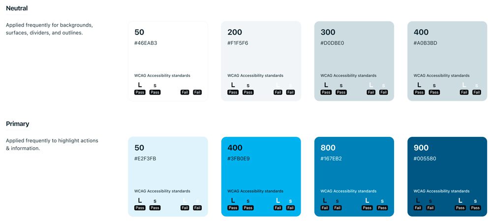
A snippet of some of the colours, including their WCAG compliance levels.
Typography
The old pattern library had some fonts already, but they were not extensive enough. In the new system I’ve pushed for progressive hierarchies, ensuring all components using these fonts will be easily readable when scanning the page.
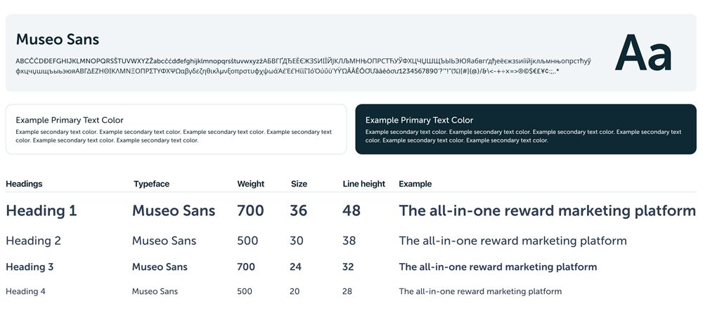
We stuck to one typeface – Museo Sans – all throughout the font system.
Grid & spacing
The spacing system is creating a harmonious experience for the end user, and it lays a foundation for responsive design and customisable UI density. I wanted a base unit that ensures visual consistency, so I’ve worked with a unit of 8px, which I’ve used successfully in the past. I’ve also introduced a couple of exceptions based on previous experience – 2px and 4px.
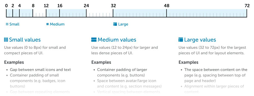
The grid & spacing guidelines
Elevation
I wanted a progressive elevation system allowing designers to give the impression of depth. Elevation would allow us to guide focus or to indicate hierarchy. We reserved heavy shadows for components that demanded full attention, such as modals and drawers. That limited their usage, keeping the elevation applied across the rest of the application subtle.
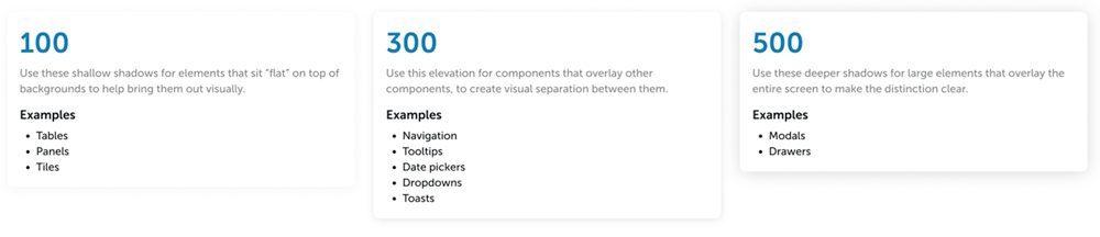
The elevation guidelines
Building components
Once the foundations were in place, we gathered a list of all the components that we were already using across the product, plus a few that were missing, and I started building them. Some needed a complete overhaul, while some stayed exactly the same as in the old pattern library. The entire set of components were built using AutoLayout, variables, and instances.
Depending on the complexity of each component, I created documentation that the engineers used for the build phase and to eventually release as part of the full Design System.
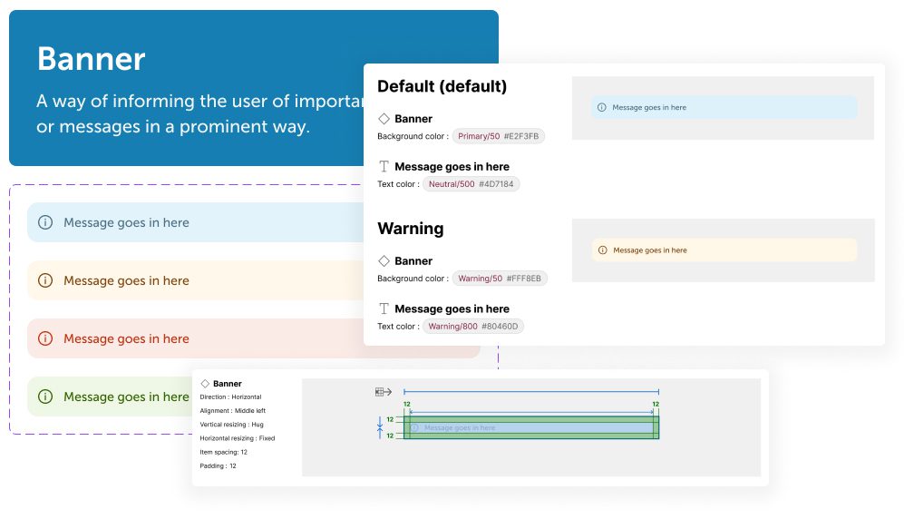
Banners
Used to display prominent messages at the bottom right of the screen. These were customisable, so we could either show/display the icon to the left, as well as switch between the different states: default, warning, danger, and success.
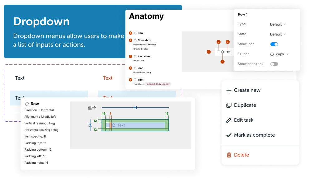
Dropdowns
Our customer portal was relying heavily on dropdowns, so I built them to be easily adjusted. Using the Design panel, dropdowns could be customised with icons, checkboxes, and switched between different states – all built into the component.
Buttons
As highlighted above, there were a lot of button variations used throughout the app. I’ve reduced everything to a primary and secondary button (large + small) and a text link button to be used as tertiary. Similar to the other components, all buttons were fully customisable from the Design panel, whether that was changing its state, adding an icon, or adjusting its size.
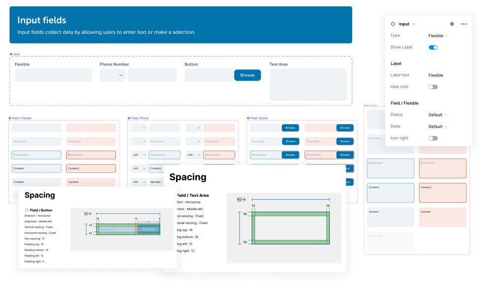
Input fields
As always, input fields require hundreds of permutations to be managed through a single component. I’ve made extensive use of atoms to build organisms, ensuring consistency and ease of build. With the new system a designer can go from one input field to a completely different one in a few clicks, with no need to adjust or detach from the main component.
These were, of course, just some of the components built, but the entire system contained many more. Among others, avatars, checkboxes, date pickers, labels, navigation, pagination, tooltips, tabs, toasts, and toggles – and documentation for each one of them – were all built as part of this effort.
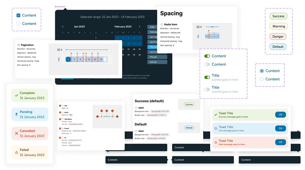
Snippet of some of the other components and documentation
Final words
After I left, the Design team at Buyapowa started using the Design System to move faster and ensure consistency. They’re also working on building these components into Storybook, to expand to a full Design System where the Figma components mirror what’s in code. Having the right foundations in place is also helping them evolve the system, which is something they’ve been doing since I left.