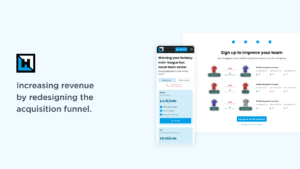
Fantasy Football Hub is a Fantasy Premier League assistant, using AI to help users field better teams to win their leagues. They wanted to turn more article readers into paying customers, so I’ve designed a new conversion funnel and used landing page best practices to help them do so.
Team
I worked with FFH as a freelancer and, as the only designer, I worked closely with the founder and a front-end engineer.
Would rather watch a video instead?
Let me narrate the project for you, take you on a trip inside Figma, show you iterations, and give you extra context.
Goals
The company has grown organically for years, but due to a change in strategy and more recent competition, they wanted to maximise the potential of their conversion funnel. Most people subscribe to FFH just before the Premier League season starts, so the aim was to launch a new pricing page and a new onboarding funnel in time for that.
Discovery
I started with an audit of their onboarding. FFH is a content-heavy machine, so they were relying on CTAs in their blog posts to lead prospects towards a rudimentary pricing page.
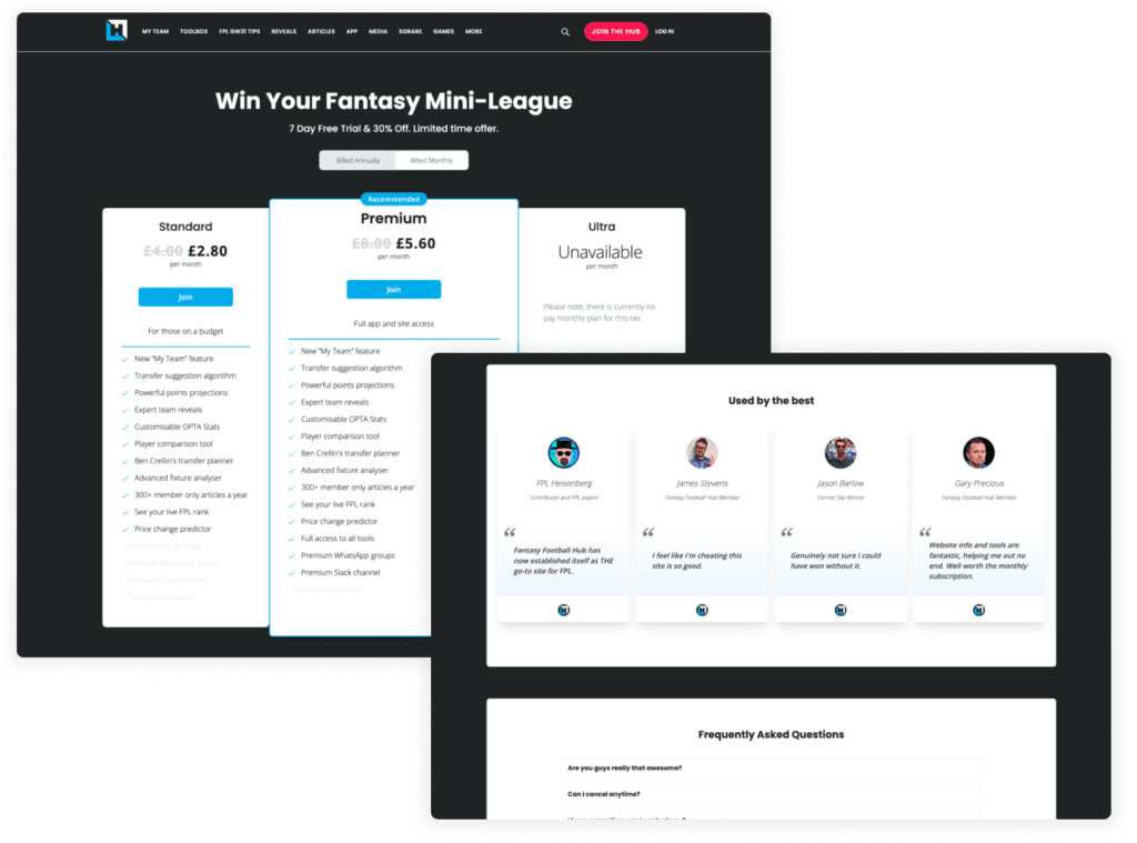
Old FFH Pricing page including the three plans, reviews, and FAQs.
Time was tight, and there was no chance to speak to users or run deep research. I had to rely on my experience with conversion funnels and industry best practices. The funnel clearly wasn’t optimised. I quickly spotted key areas for improvement, and my early work highlighted three main opportunities:
#1: Small top of the funnel
→ HMW capture more people into the acquisition flow?
#2: No proof of the product
→ HMW tease visitors with our most popular feature(s)?
#3: Outdated pricing page
→ HMW make the the plans page more informative and enticing?
Opportunity #1: Small top of the funnel
I saw a chance to grow the top of the funnel by redesigning the homepage. The old version was just a list of articles, but best practice calls for a clear offer, social proof, and a strong CTA above the fold.
I turned it into a proper landing page: leading with the main offer, adding reviews and member stats, explaining the benefits of subscribing, and including a video teaser.
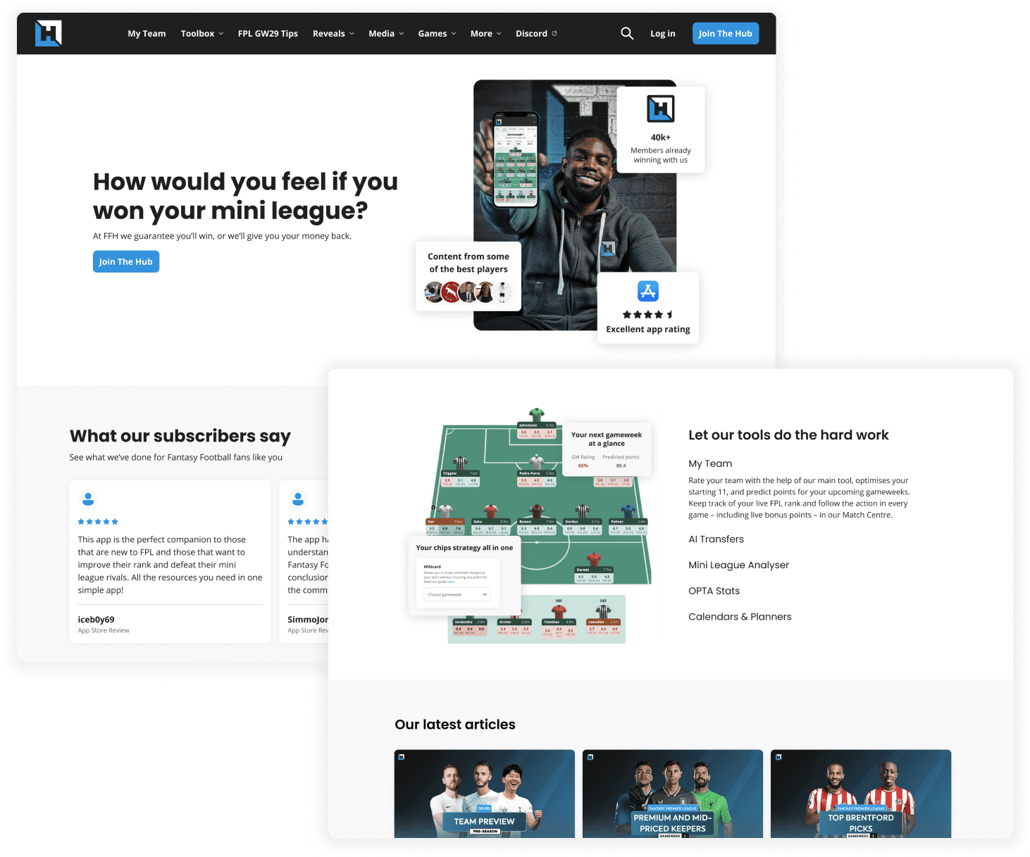
Enticing one-liner to capture attention.
Different ways of showing social proof, with an image of Micah Richards (well-known footballer) in the centre.
Accordions highlighting the most important features of FFH.
Opportunity #2: Teasing users
Once we had interest, the next step was to show users what FFH could do — not just tell them. We picked a key feature to tease: the transfer tool, which helps users decide which player to buy or sell each matchday based on budget and predicted points.
I designed a simple flow where users added their team, got a rating, and saw a teaser of transfer tips to boost that rating. To see full suggestions and improve their points next matchday, they had to subscribe.
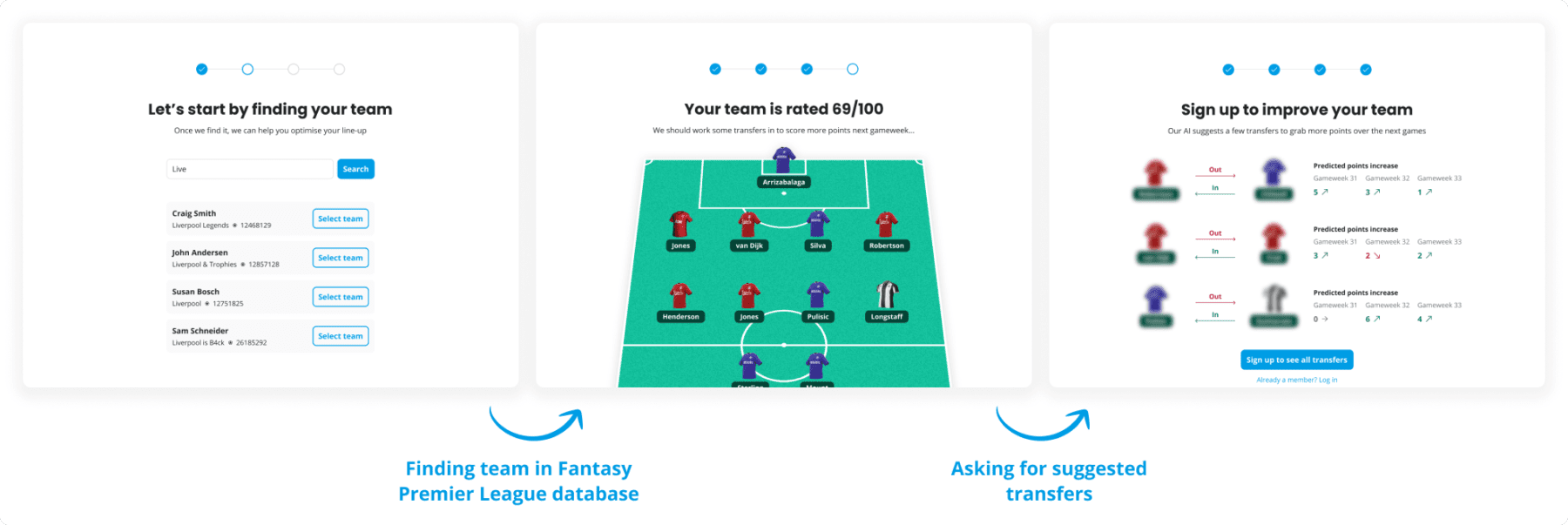
One of the three ways of searching for your team was by name. The other two were manual input and through FPL ID log-in.
We’d rate the team using our AI and give it a score. At the bottom, a “Suggest transfers” CTA entices people to continue.
We’d show the transfer suggestions, blur them out, and ask people to sign up to see them.
Opportunity #3: Outdated pricing page
Once users saw they could boost their team to a 95/100 with a few transfers, they were ready to subscribe. The final step was a better pricing page.
I used price anchoring, highlighted the best-value plans, downplayed the free option, and added social proof. I also worked with the founder to tweak the pricing tiers for stronger anchoring. Finally, I improved the design — a polished, high-quality page helps build trust and nudges users to act.
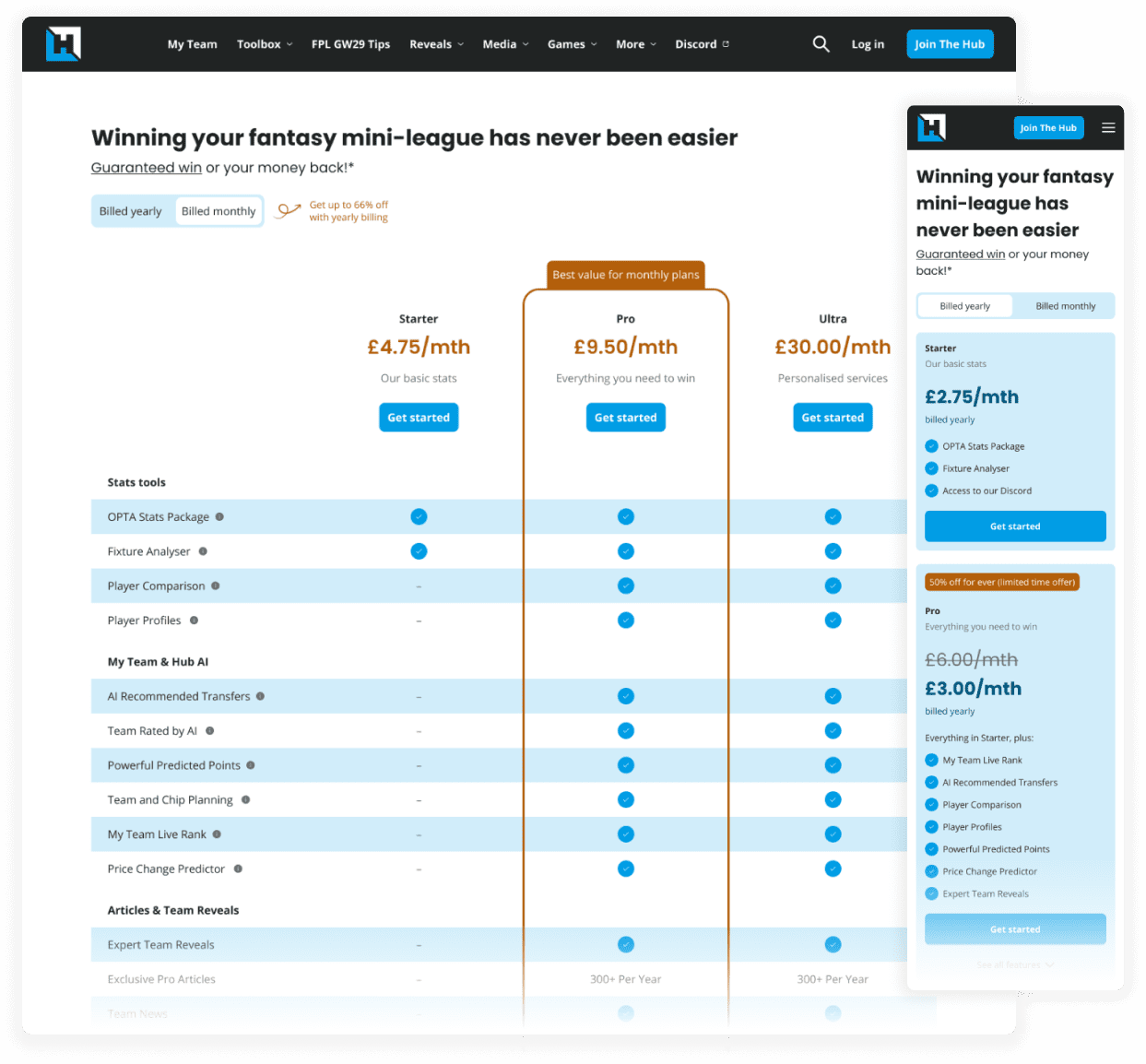
Continuous reminder of their enticing “Win or get your money back” policy.
Much clearer overview of what feature is included in which tier – much easier to see which tier is the best value.
Different design treatment for smaller breakpoints.
Design handoff
Once the team was happy with the designs and the deadline was looming, I’ve carefully handed off the designs to the front-end engineer. I also worked closely with him to provide design QA, making sure that the experience users would see was as close as possible to what I intended it to be.
Outcomes
When I joined, FFH had no analytics. I led the Amplitude integration and helped the team use it, but we lacked historical data such as the year-on-year Conversion Rate improvements. That’s why we chose to look at revenue to track success. By the end of the sign-up peak, revenue was up 120% vs expected growth — clear proof the redesign and optimisation beat all expectations.