Helping designers make sense of their research with a repository app
Filo started out with a simple mission: to help design teams make research more accessible, effective, and actionable. We’ve based our repository around storing, sharing, and showing the impact of research.
This is only a brief version of the project. Reach out if you’d like to know the full story.
Goals
The goal was to become the go-to research repository within two years from launch. We knew this was ambitious, but our experience in the field of design and research told us that there was a big gap in the market for this type of product.
Discovery
While usually at this stage I would embark on a mission to find out everything there is to know about the problem at hand, this time was a bit different. This product would be scratching my own itch. Not only was I familiar with the pain points, but Luke, a seasoned researcher, could add to the list as well. So we started by organising and prioritising our list of pain points.
Demonstrating a product/market fit
The biggest priority was to demonstrate that we had an idea worth building, so we interviewed researchers and designers in our network about how they do research. It didn’t take many conversations to understand that we were onto something. We were not the only ones struggling with collating and actioning research; the whole industry was. These interviews acted as the green light we needed to move forward.
Biggest pain points
We’ve learned that everyone needed “a single source of truth” to store findings, show the business impact of their research, and share learnings. Because that tool didn’t exist, they were all experimenting with tools created for others purposes (Jira, Trello, PowerPoint, etc).
We also uncovered that researchers struggled with showing the impact of their work, and that managers had no way of knowing whether their research teams were performing well in relation to the product and business goals.
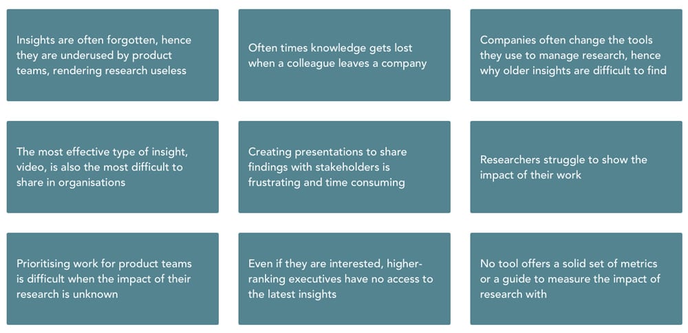
Major pain points we discovered
Transitioning to ideation
Turning problems into challenges is something I do using How Might We questions — one of the tools that I find the most useful to transition from Discovery to Ideation. I’ve put together a list of HMWs that helped us frame our findings and decide what the MVP should include.
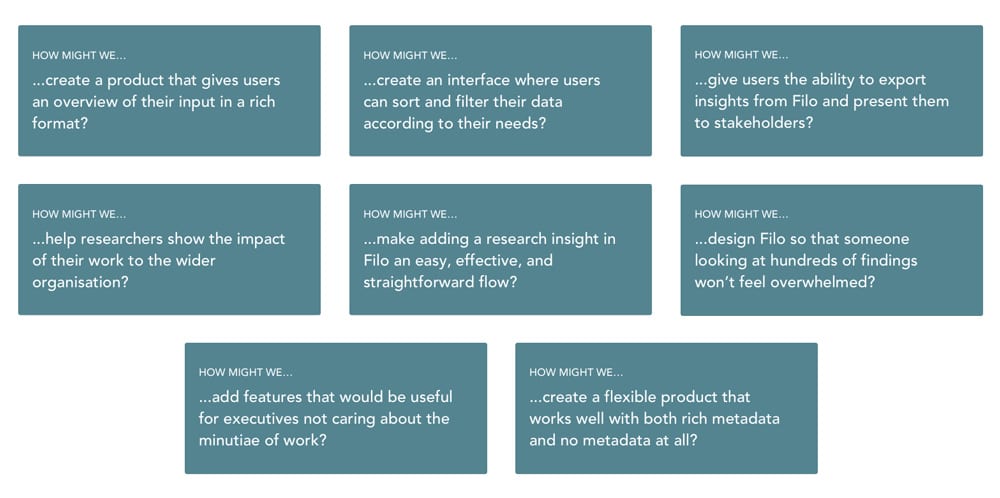
The HMWs we based on MVP on
Main focus areas
There was not only a matter of what we wanted to do, but also of what we had time and budget for. We simplified and focused on four areas of focus for the MVP.
Make it easy to add and view problems in the repository
Give customers a way to export their findings
Display impact metrics that could be linked to problems
Build a way to see an overview of research efforts
Ideation
Since we were looking at a process that was different for every team we spoke to, we needed to find a common denominator — the one thing that every team thinks of in the same way. We realised that however they do research and whichever tools they use, all teams start with problems. That’s why we’ve designed Filo around ‘problems’.
We wanted to help teams show the depth of their work, so we added metadata they could enhance problems with: status, impact, themes, lenses, quotes, and media. These are tools that researchers are familiar with, but there was no product where they all could be integrated seamlessly.
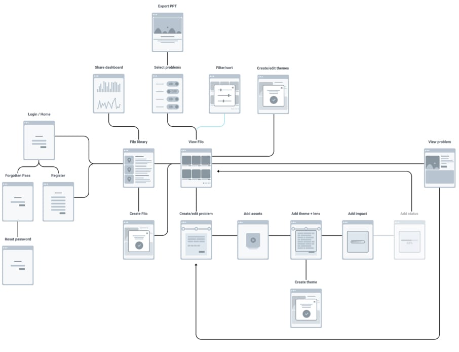
The basic IA we came up with for the MVP
Wireframing
While exploring ways to meet the four MVP goals, we came up with several ideas that ended up shaping the product:
- allowing users to export insights into a PowerPoint template to save time
- introducing ‘sales’ and ‘contact’ impact categories to give users metrics to attach to their problems
- introduced the concept of ‘themes’ and ‘lenses’ to allow users to categorise problems based on their place in the user journey and complexity; this, together with the impact, helps teams prioritise work
- built ways to attach videos and quotes recorded during customer interviews to each insight to make findings more impactful
- brought it all together in a dashboard to show how much impact can be made by solving certain problems.
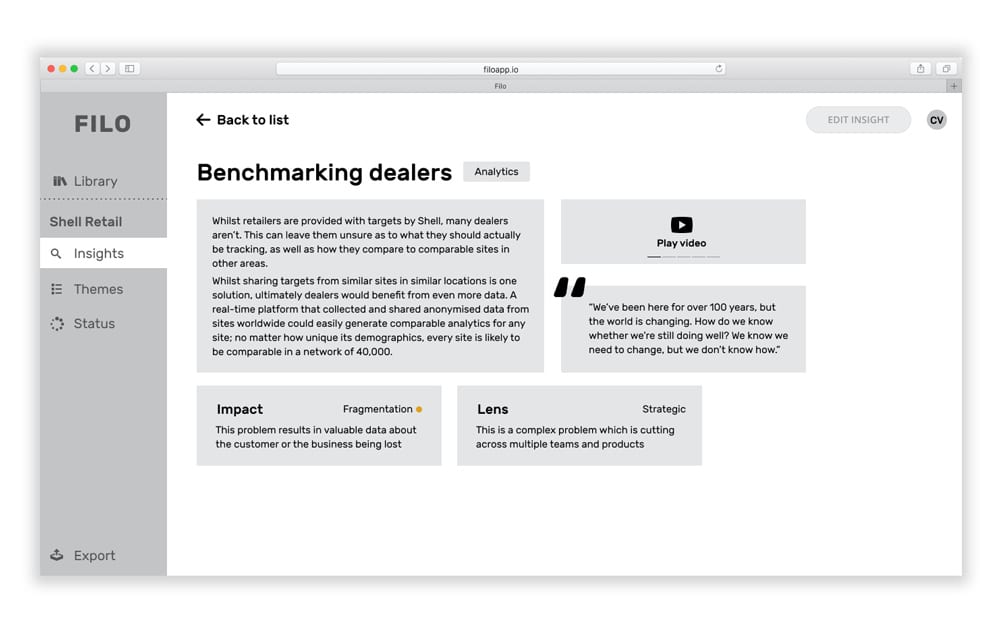
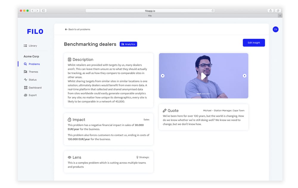
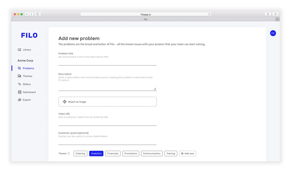
The description of the problem, placed right before the title and theme
A place for videos/photos and customers quotes, some of the best ways to frame problems in large organisations
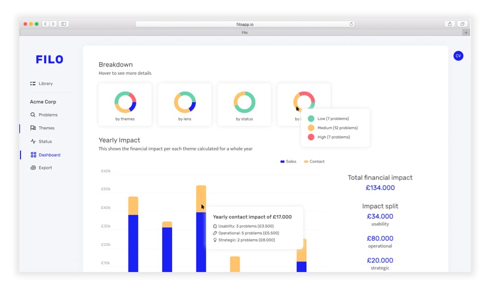
Showing how this problem impacts the business. ‘Fragmentation’ is one of the three impact metrics that didn’t make it in the MVP.
The wireframe of the problem view
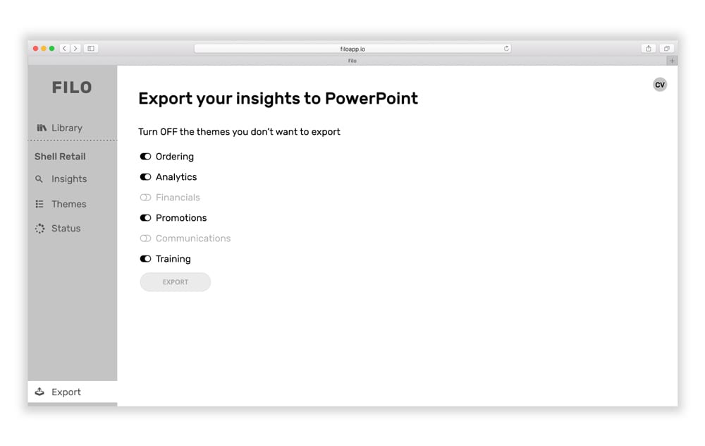
Exporting problems to PowerPoint is as easy as toggling themes on and off
Initially, the ‘Export’ menu option was at the bottom, as we wanted it to stand out. We dropped this in the final design.
The wireframe of the export screen
Our early Discovery efforts gave us the confidence that we have a product/market fit, so we saw no need for conceptual testing. However, we did run a few usability testing sessions to see whether the way we’ve designed the product made sense. We discovered issues which we fixed before launching, but nothing major.
Design
We knew that users might add hundreds of problems to Filo, so it could easily become overwhelming. This is why I chose a minimal design with a light colour scheme, generous white space, and clear call to actions. I’ve also tried to keep the interface and copy slightly playful, following other B2B platforms such as Slack or InVision. To build the app faster and to ensure consistency, I’ve also created a pattern library.

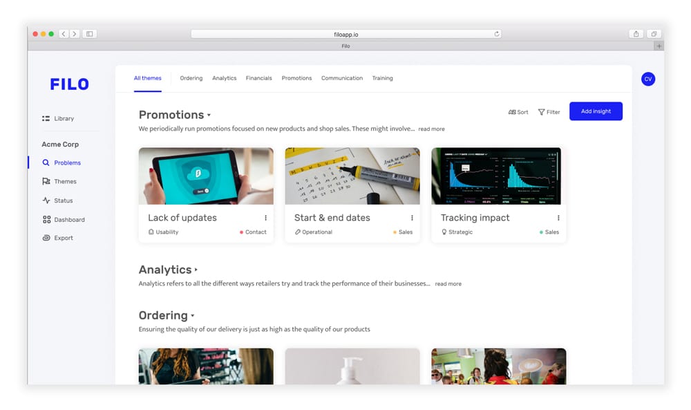
Quick way to filter through the problems in different themes.
Displaying problems with the most important metadata — impact and lens.
Themes are collapsible to make large lists of problems less overwhelming
The page where users can see all the problems in a project
Quick way to navigate back to all problems
Photos, videos, and any customer quotes sit on the right-hand side to not risk being pushed below the fold
The view of a specific problem with all its metadata and media
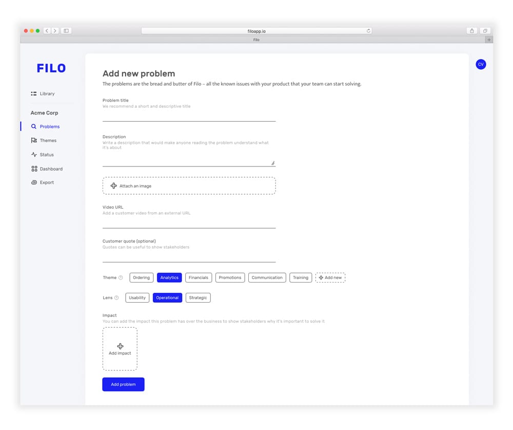
Themes can be quickly added from here if they don’t exist yet
Impact can be added from here in a modal appearing on top
Adding a problem in Filo in one step
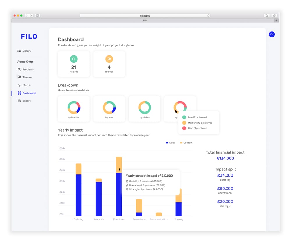
Seeing a breakdown of all problems helps teams understand where their efforts should be directed to
The impact section is the most useful, showing how problems of different complexities discovered through research can help the bottom line
The dashboard showing the impact of the research team
Post-launch and second iteration
We’ve launched in beta using our own channels and network, and added a section where users could give us feedback. Soft-launching helped us understand if our approach made sense. We took a few weeks to improve our beta product, since it became clear that we missed the mark on some aspects. The feedback received was surrounding four main areas:
- improving the flow of adding problems
- removing confusing metadata such as themes and lenses
- simplifying the library view
- rethinking the impact feature.
Old “add problem” screen (left) and the improved version (right)
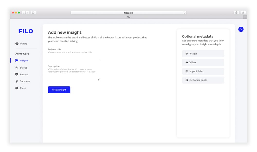
Better flow for adding problems & removing confusing metadata
Problems, renamed to insights, sit at the core of Filo. The flow of adding problems in v1 was too complex, so we’ve moved the optional metadata to a sidebar and left the mandatory fields unchanged. This made it more clear what was required and what was optional and it also allowed us to keep the whole screen above the fold.
Removing ‘themes’ and ‘lenses’
Feedback told us that our approach of ‘themes’ and ‘lenses’ was limiting. Instead of trying to force everyone to use our research methodology, we’ve taken a step back and allowed teams to input insights in whichever way they saw fit.
Old repository (left) and the improved repository (right)
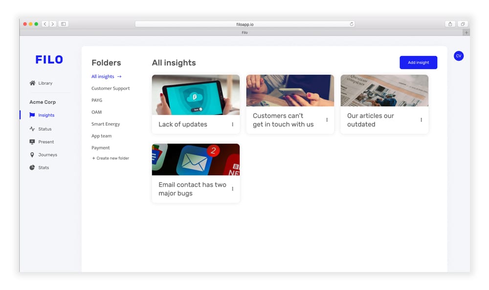
Simplifying the library view
With ‘themes’ and ‘lenses’ gone, there was no way to sort insights in the library anymore. This is why we’ve added folders and simplified the design — now displaying only an image and the title. This makes for a much simpler and intuitive interface.
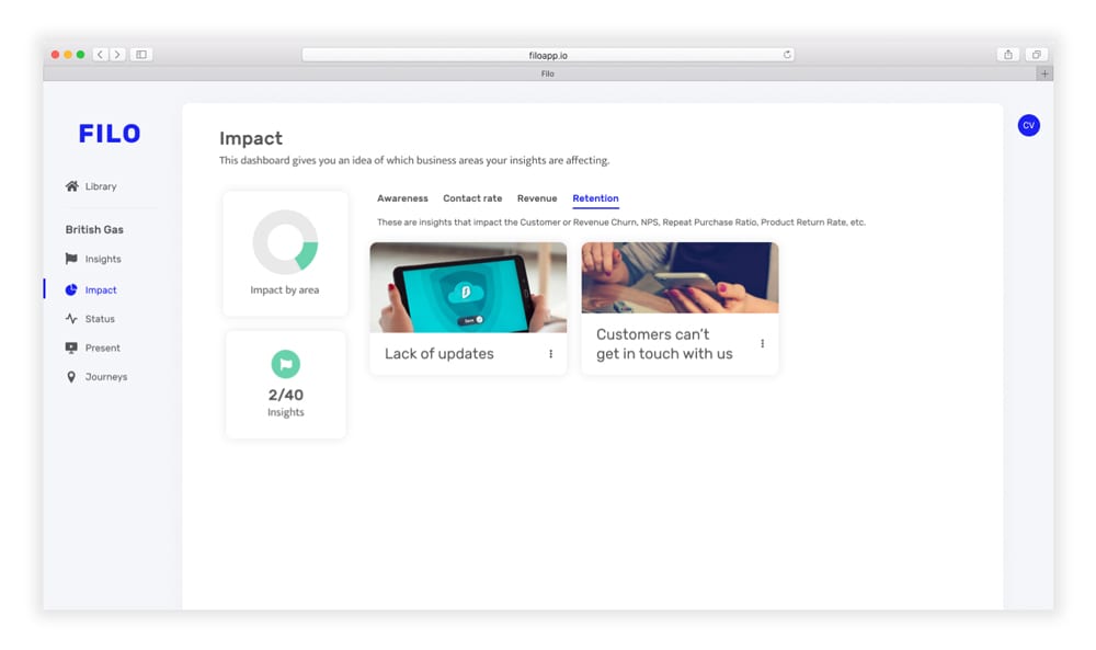
Old Dashboard (left) and the improved Dashboard, renamed to Impact (right)
Rethinking the impact feature
One of the features we were most vocal about in the MVP was the option to attach numbers to problems — how much would fixing this problem save us? But most teams didn’t have these numbers, so as much as it hurt, we had to kill our darlings and re-think ‘impact’.
Instead, we allowed users to add data based on pirate metrics, a more widely-used framework. The concept changed from “These issues cost you £150,000” (which most teams wouldn’t know) to “These issues impact your retention” (which was enough to help teams start tracking impact).
Final words and lessons learned
One aspect I’ve learned is that testing prototypes with friends will likely skew your results, since they are less likely to give criticism. We would’ve moved faster if we discovered more issues earlier, so in hindsight, we should have tested with other subjects.
Working on Filo has also confirmed to me something that I’ve long believed — that it’s possible to build a company, a team, and a good product working entirely remotely. Luke, John, and I have met in person just one week before launching. This strengthened my opinion that the dichotomy of ‘creativity only happens when people sit together in a room‘ is false.