Originally published on Uptime Design
When I joined Uptime in late 2020, the product team consisted of seven engineers, two designers, one product manager, one product analyst, and one QA analyst. The needs of our team and our processes were simple, so we created a basic Figma file structure to move away from Sketch. We started out with a working file (where designers would ideate and explore), a handover file (for the finished designs that engineers would work based on), and a pattern library file. Later on we introduced an archive for older designs.
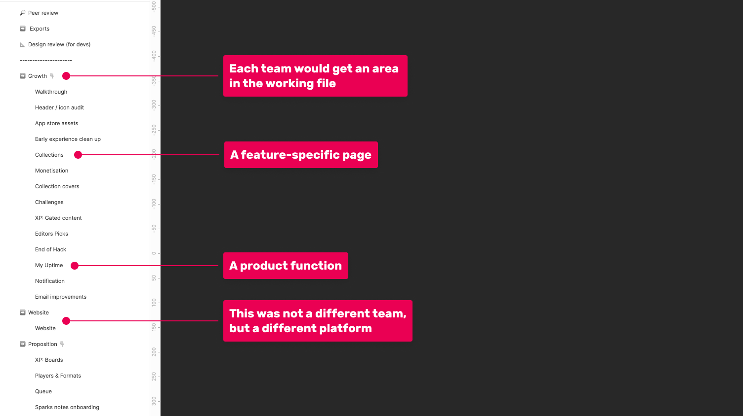
The old Handover file structure
This structure worked well for us until recently, when it became clear that we needed to make a change.
In the past year and a half our design team tripled, our engineering team increased by half, and we’ve hired a UX writer. Other business functions have also expanded, with more than 15 people now needing access to final designs.
In the past year we’ve also made monumental changes to our product. In order not to bore you, I’ll only list the major ones. We’ve introduced monetisation, collections, granular notifications, streaks, stats, offline capabilities, challenges, sparks, a referral mechanism, podcasts, and we’ve redesigned all our three players (text, audio, and story). All of these have multiple versions, since we A/B test most of the features we launch. You might even venture out and say we kick ass at this remote working thing.
But when the product team moves mountains, it puts a strain on tooling. It stress-tests and challenges the ways of working. The structure we’ve created for the small team we were didn’t translate well for the team we became. In other words, Figma became an annoying pain in the ass.
What were the issues?
Engineers were complaining about not being able to find designs, since the way we structured the Handover file was not aligned with the way we structured the product. This was also an issue for our marketing team and other stakeholders who couldn’t find the latest designs.
Since part of the working file was organised based on features, it was difficult to keep designs that were spanning different features updated. For instance, if we launched three new features, each with a toggle under the Settings page, each individual page would have its own version of Settings. If we make a general change to the Settings page, updates need to happen in multiple places.
The old Figma structure was also an issue for new joiners. Since designs for a specific feature could be anywhere, it was never easy to pinpoint a specific screen. It was also confusing for new people to wrap their heads around why we structured the file the way we did.
A large issue was performance. Since all the designs from the four streams of work were in the same file, each designer would at all times have thousands of artboards and frames open in the background, and many of them were being edited live. Some of our computers couldn’t handle that, and loading files would take too long.
What did we do?
After these issues were brought up over a few weeks, and since we don’t have a separate DesignOps function, I started looking into this myself.
I had a chat with the design team to understand how they thought we could organise Figma in a better way, and I found two articles from Spotify and Onfido, who’ve also struggled with similar issues.
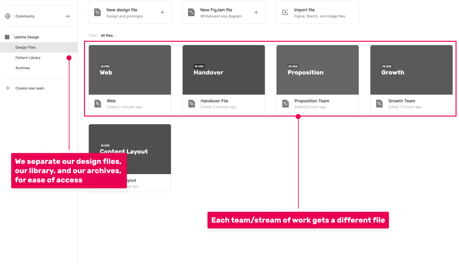
An idea that I kept hearing was splitting the main juggernaut file based on the different work streams. That would reduce performance issues and would allow each team to have their own preferred file structure. It felt like the most natural change, so that’s where I started.
Splitting the working file was a matter of a few hours of work while the team was fast asleep. The difference in time zone does come in handy sometimes.
How we’ve organised the library
The bigger challenge was re-structuring the Handover file without wrecking too much havoc on current processes. As shown earlier, our Handover file was organised both in feature-specific pages and product function-specific pages. The team decided to try structuring the Handover file based on the product structure only, and not based on features.
With this in mind, I shuffled designs around for hours, trying to organise them as accurately as possible. There was a lot of duplication to remove, many outdated designs to replace, and a new place to find for designs that spanned across multiple product areas (think dark mode screens or error states). After a few more hours, I got the Handover file to a better place.
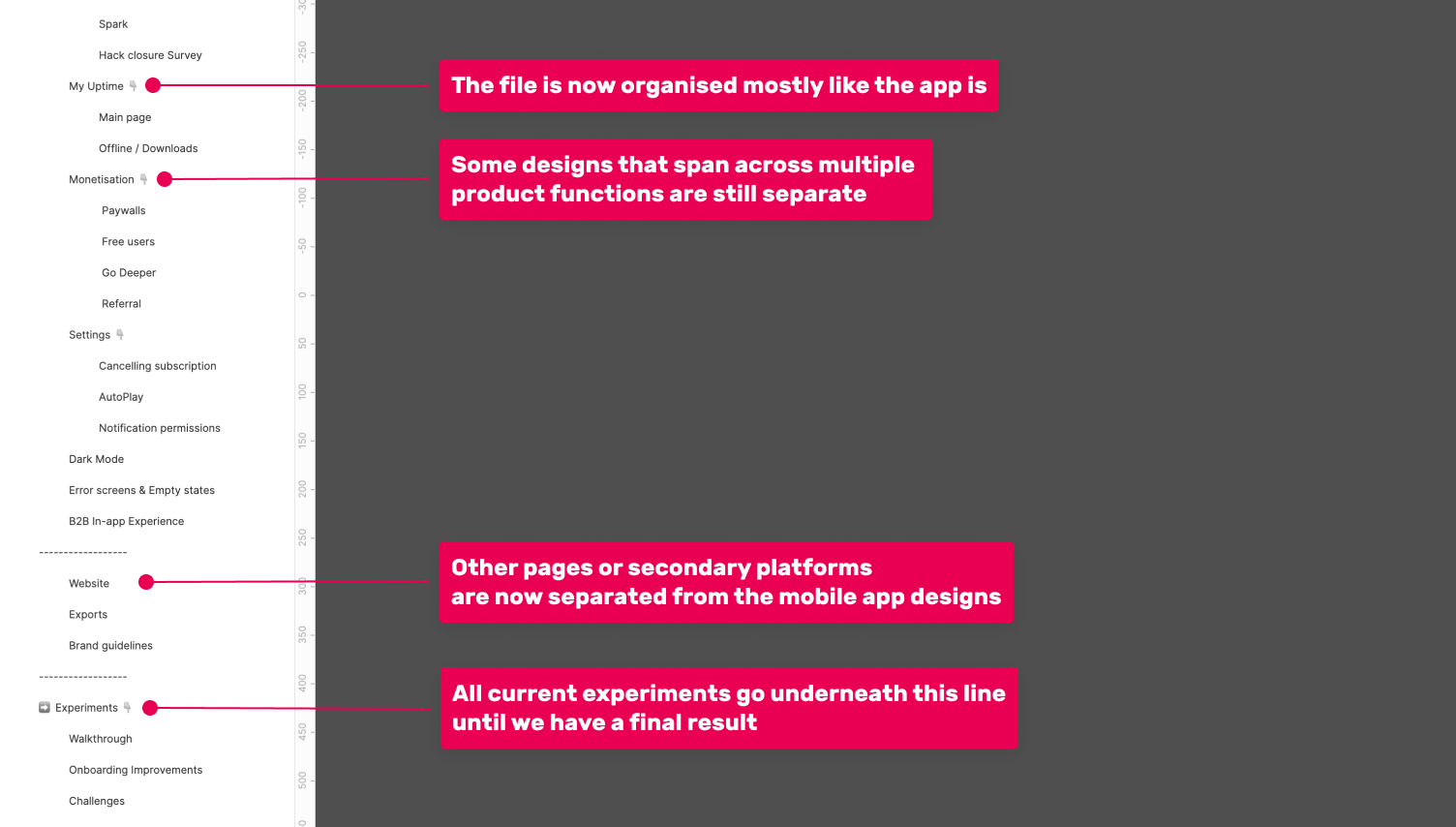
The new Handover file structure
What we kept
Over the past 18 months we’ve created a few processes that we are still happy with, so we brought them over to the new file structure.
Archive
Despite splitting the files and performance not being an issue anymore, we still kept the archives (we create a new one each year). That way designs that aren’t actively being worked on or that have never even made it in the app (exploration) have a place to be parked without interfering with our day-to-day. We can always go back to find a previous iteration or exploration.
Peer review
Just like engineers peer review each other’s work, at Uptime designers do that as well. Once a set of designs is ready, it gets moved into the “Peer review” page. On here the design has to be peer reviewed by another designer before it can be moved to the Handover file.
Experiments area
At any one time we run multiple experiments, but we don’t want the designs for these to be spread around the Handover file, only to then be removed if the experiment fails. For that case we have a separated area at the bottom of the Handover file, where we keep all our experiments. If the experiment wins, the designer responsible goes back and moves the individual screens to where they belong. If the experiment fails, the designs get moved to the Archive.
Conclusion
We’re a couple of months into these new changes, and we’re watching closely to see how we could improve further.
If you’re struggling with the same issues, feel free to copy our approach if it matches the needs of your team. And more importantly, whatever approach you choose, make sure you write about it and share with the wider design community. Reading the two articles from Onfido and Spotify helped me solve this for my team. I’m sure that what you end up writing will help someone too.